
FloraVolt Packaging
The task was to transform a discount-retailer product through comprehensive rebranding and custom packaging design. This task emphasizes dieline manipulation, brand development, and professional package engineering from concept through prototype or digital model.
Product I Chose
The product I chose was sure scents oil warmer refills from the dollar tree. The packaging is in a blister pack with a cardboard back and plastic front.
About The Brand
Brand Name: I decided to model these products as each representing a floral scent. Orange represents marigold, blue represents bluebonnet, and red represents rose. The brand name is FloraVolt because I wanted to go for something that mixes the idea of flowers "Flora" with an electric term, hence why "Volt" was chosen. Mixing these two words together is beneficial for the product, since this is technically an electric product that plugs into your wall.
Brand Guide
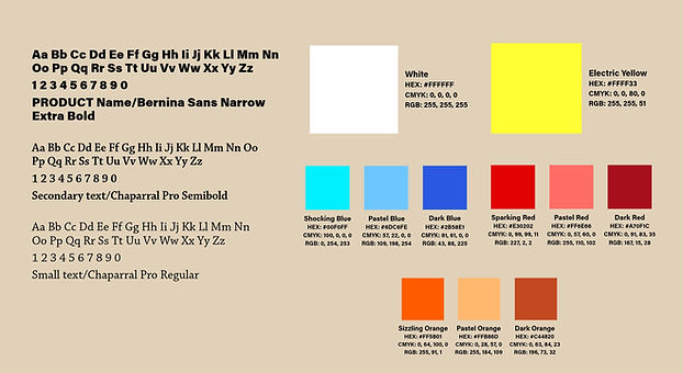
Typography: I wanted the typefaces to be bold for the product name. However, I also wanted to channel in a little softness, since this is a floral product, so a serif typeface was used for the subheads, and body.
Color Palette: For the color palette, the main identity comprised of white and neon yellow. For the main 3 scents, a neon, muted, and dark color was used to make everything pop out more.
Logo
Below shows the final logo for FloraVolt. The main idea for the logo was to incorporate that floral/electric feel. This was done by using the "L" in the name as an electric flower. It's an electric flower due to the bulb in the middle simulating an electrical plug.

Final Packaging Design
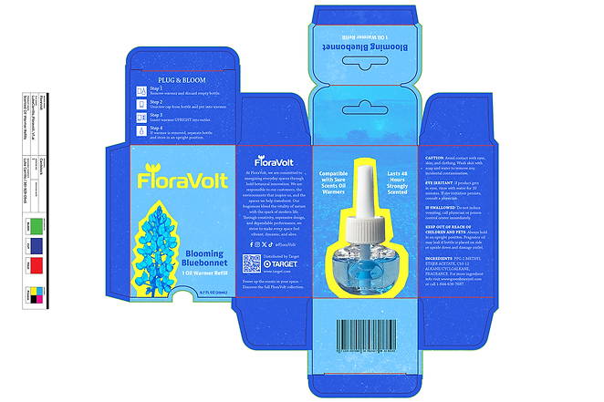
Blooming Bluebonnet: Ultimately, a lot of changes were made to get to this point. For instance, the color system makes everything pop out more. Duotoned imagery was used to make the packaging feel bold and current, as well as give dimension to everything. Finally, some grittiness was put in to give some texture to the package.
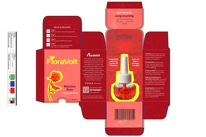
Reactive Rose: Below shows the final dieline for Reactive Rose.
Magnified Marigold: Below shows the final dieline for Magnified Marigold.

Final 360 Product Renderings
Blooming Bluebonnet: Below shows the final product rendering for Blooming Bluebonnet.
Reactive Rose: Below shows the final product rendering for Reactive Rose.
Magnified Marigold: Below shows the final product rendering for Magnified Marigold.
Final Website Landing Page
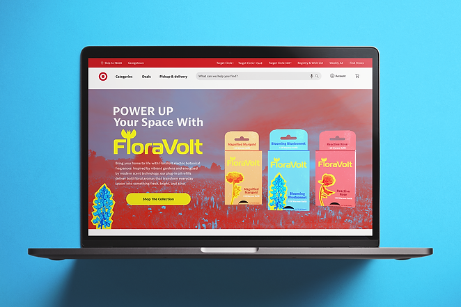
Below shows the final landing page for FloraVolt. This product would be sold in many department stores, but I specifically focused on Target and their UI. For the webpage, I used the same formula for the brand with the bold type, sharp bordered imagery, and vibrant duotoned colorization.
To view a walkthrough of the process, please view my Behance link: Click Here